
Analyzing time and attendance data with Claude
Create reports, visualize trends, and analyze Jibble data with Claude
Jibble tracks detailed information about working hours, attendance, overtime, projects, activities, and time off. With Jibble connected to Claude, you can go beyond viewing your data and use Claude to analyze it, create custom reports and summaries, visualize trends, and compare results across your workforce.
Learn more about Claude time tracking, or explore what you can do with Jibble in Claude.
This article covers:
- Analyzing Jibble data with Claude
- Creating custom reports and summaries
- Visualizing time and attendance data
- Comparing data and identifying trends
- Creating recurring reports
- Getting the most from your Jibble data
Analyzing Jibble data with Claude
Claude can analyze the Jibble data available to your account and help you understand how time is being spent across your team.
Depending on your role and permissions, you can ask Claude to:
- Analyze working hours across a specific date range
- Identify overtime patterns
- Compare attendance between teams or periods
- Break down hours by project or activity
- Highlight significant changes or unusual patterns
- Summarize key findings from your time and attendance data
- Generate management or payroll summaries
For example, you could ask Claude:
“Highlight unusual time tracking patterns for the Engineering group for August.”
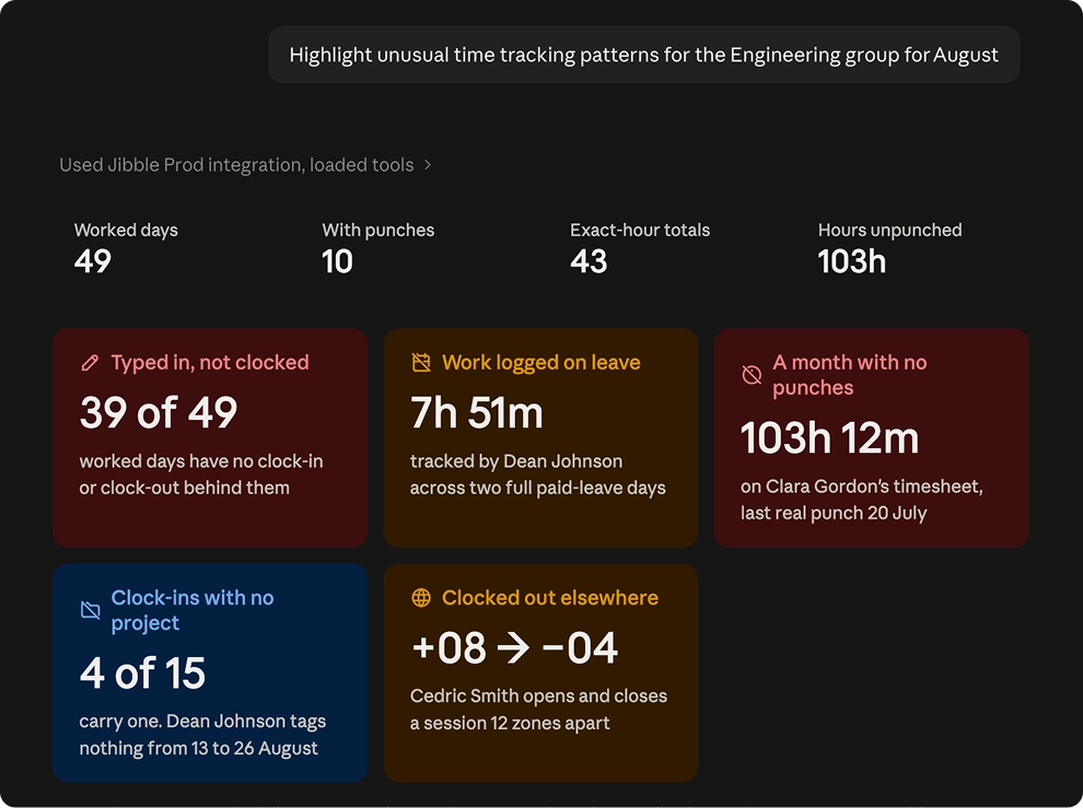
You can also refine the analysis through follow-up questions. Start with a broad request, then ask Claude to investigate specific findings or areas without starting a new analysis. This makes it easier to move from a high-level overview to a more detailed analysis of your Jibble data.
Creating custom reports and summaries
Claude can help create reports using the specific data and breakdowns you need, without having to manually configure multiple report filters.
You can combine different metrics, people, teams, projects, activities, and date ranges into a single report.
For example:
“Create a report showing each team member’s total hours, overtime, and attendance for August.”

Claude can organize the relevant data into a report and summarize the key findings. You can also tailor the output for a specific purpose, such as a management update, payroll review, or project report.
Visualizing time and attendance data
One of the benefits of analyzing Jibble data with Claude is the ability to turn your data into charts and visual summaries.
Claude can visualize different types of Jibble data, making it easier to spot patterns, compare results, and understand changes over time. Depending on the data you’re analyzing, you can create visualizations for:
- Hours worked by person or team
- Overtime by person, team, or period
- Hours spent across projects or activities
- Attendance trends over time
For example:
“Create a chart showing total hours worked by each team member in August.”
You can also ask Claude to change the visualization, focus on a specific group, or combine relevant data points to make the results easier to interpret.
Comparing data and identifying trends
Claude can compare data across different people, teams, projects, or time periods to help identify changes and trends.
This can help you identify:
- Increases or decreases in working hours
- Changes in overtime
- Attendance patterns
- Differences between teams
- Changes in project hours
For example:
“Compare our team’s working hours and overtime for August with July, and highlight the biggest changes.”
or:
“Compare the hours logged to each project and show which projects have increased the most.”
You can then ask Claude to investigate a particular change or break it down further.
Creating recurring reports
Claude can also automate recurring analysis using scheduled tasks. Instead of manually requesting the same analysis each week or month, you can set up Claude to regularly analyze your Jibble data and provide a report.
For example, you could create a weekly workforce report covering:
- Total hours worked
- Overtime
- Attendance
- Time off
- Project hours
- Significant changes or trends
A scheduled task could run every Monday and analyze the previous week’s Jibble data:
“Every Monday, analyze last week’s team hours, overtime, and attendance. Summarize the key findings and highlight any significant changes.”
You can also include visualizations in a recurring report:
“Every Monday, create a chart of last week’s hours by team and summarize any significant changes in overtime or attendance.”
Recurring reports can be useful for:
- Weekly team reviews
- Monthly attendance summaries
- Project hour tracking
- Overtime monitoring
- Payroll preparation
This can help keep recurring workforce reviews consistent and reduce the need to manually prepare the same analysis.
Note: Scheduled tasks are a Claude feature. Their availability and functionality may depend on your Claude plan or account settings.
Getting the most from your Jibble data
For more useful analysis, give Claude enough context about what you want to review. Where relevant, include:
- Date range: such as “1–31 August”
- People or teams: such as “the Engineering team”
- Projects or activities: such as “Project Alpha”
- Metrics: such as “total hours, overtime, and attendance”
- Comparison: such as “compared with July”
For example, instead of:
“Analyze our hours.”
Try:
“Analyze the Engineering team’s total hours and overtime from 1–31 August, compare them with July, and highlight any significant changes.”
You can then continue the conversation with follow-up questions to explore the results in more detail.